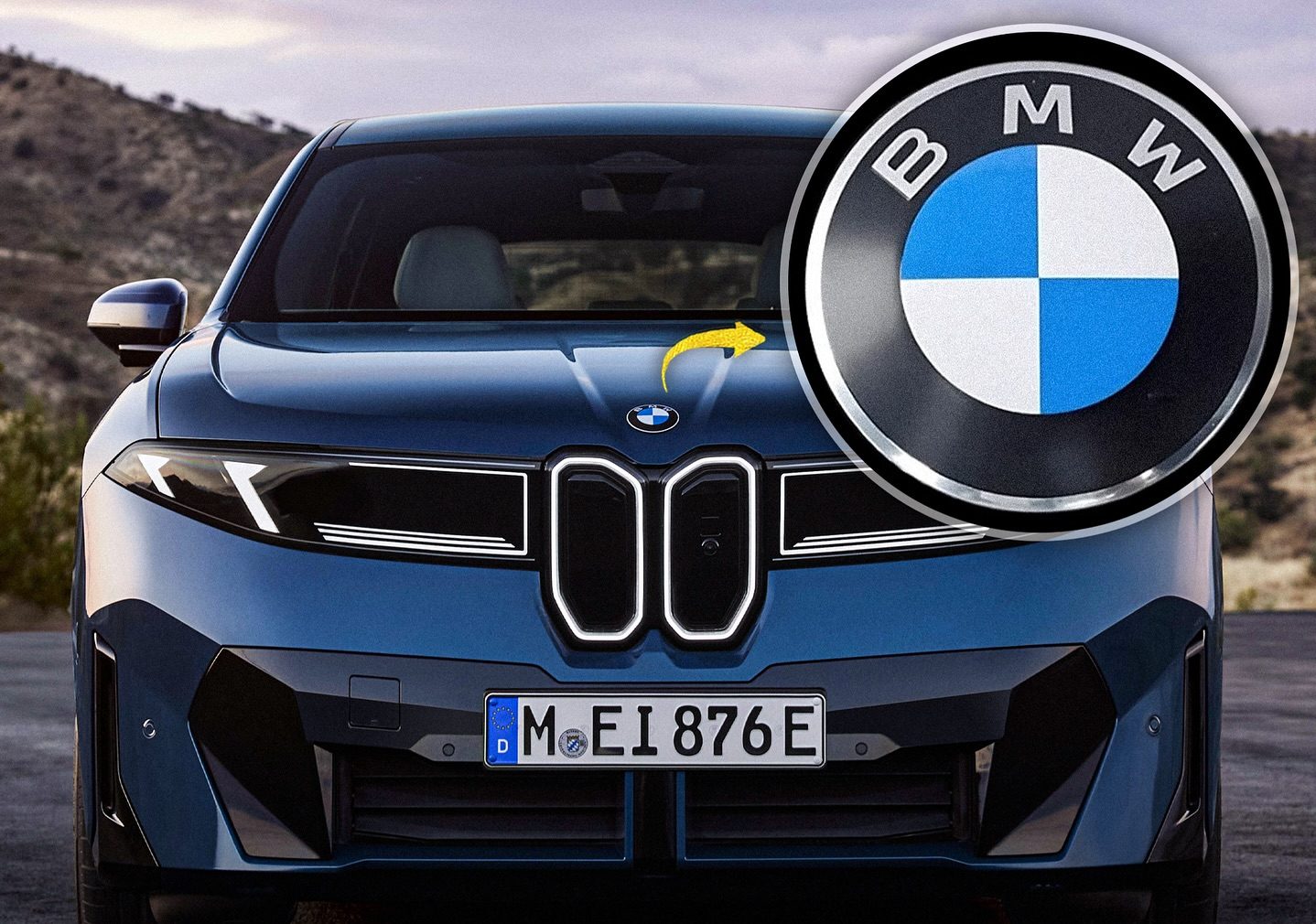
BMW Unveils a Refreshed New Logo for 2025, Spotted on the iX3 in Munich and Designed for a Digital Future
BMW has always been more than just a car company. It’s a brand that blends tradition and innovation, performance and style, engineering precision and emotional appeal. For over a century, its blue-and-white roundel has been one of the most recognizable logos in the automotive world. Now, in 2025, BMW has given that symbol a modern refresh, one that speaks to the times while keeping its roots intact. The change was first spotted on the updated iX3 at the Munich show, and though subtle, it has already stirred conversations among enthusiasts, designers, and brand followers everywhere.
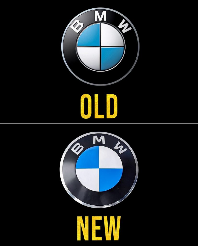
At first glance, the new logo might look almost the same as the one etched into memory by millions of drivers and fans. But the differences matter. Gone is the chrome ring that surrounded the iconic roundel for decades. Instead, BMW has opted for a sleeker, cleaner look that strips down unnecessary elements in favor of digital clarity and modern minimalism. The inner ring that once defined the border has also been removed, leaving a more open and transparent design. The result is a logo that feels lighter, sharper, and far more in tune with contemporary design language.
For many people, this might feel like déjà vu, because BMW already took a big leap in 2020 when it revealed a flat, two-dimensional version of its logo on the Concept i4. That move was intended mainly for digital and marketing use, where 3D shading and chrome didn’t translate well to screens. The transparent redesign was bold at the time, replacing a logo that had become almost sacred in automotive circles. Now, five years later, the company has taken that vision a step further, carrying it onto production vehicles for the first time in a way that blends heritage with forward-looking identity.
What makes this shift fascinating is the way BMW is trying to balance its proud history with its ambitions for the future. The roundel, with its Bavarian blue and white quadrants, is a piece of automotive culture. To alter it in any way is to risk upsetting a fanbase that holds tradition dearly. Yet, as the industry moves toward electric mobility, digital integration, and new customer experiences, BMW knows it cannot stand still. The updated logo is symbolic of the company’s broader evolution—a cleaner identity for a cleaner era of cars, where sustainability and technology define the road ahead.
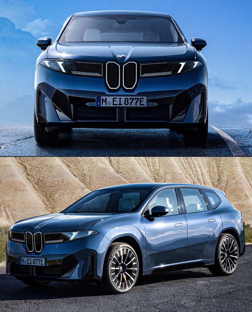
Seeing the new roundel on the iX3 is particularly fitting. The iX3 is one of BMW’s key electric SUVs, a bridge between the brand’s traditional strengths in driving dynamics and its bold future in electrification. The fresh logo on its hood doesn’t just represent a cosmetic tweak—it serves as a badge of transformation. It tells the world that BMW is embracing change without abandoning what makes it BMW. That’s a delicate balance, and it’s one that not every carmaker has managed to pull off.
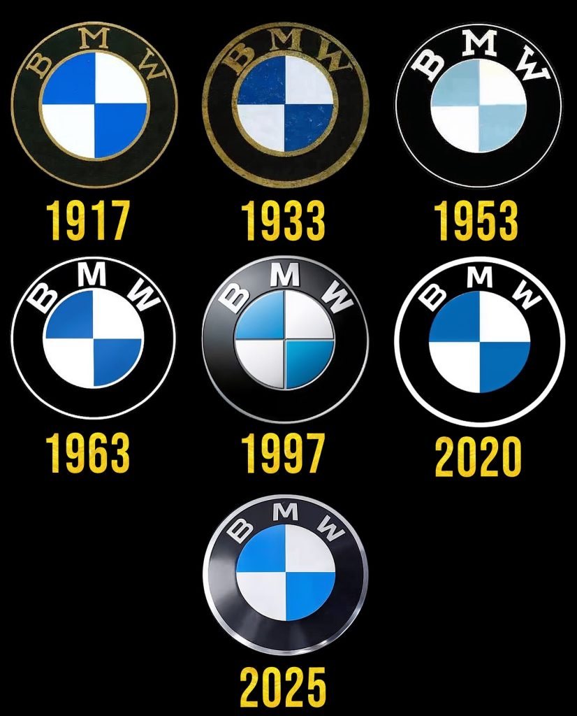
The story of BMW’s logo is itself a journey through design history. Introduced in 1917, the roundel originally drew inspiration from the Bavarian state colors, though it has often been misinterpreted as a spinning propeller because of BMW’s aviation roots. Over the decades, the logo was tweaked and refined but never radically altered, always maintaining its circular shape and blue-white core. Chrome, 3D effects, and shading were gradually added to give it depth, especially as cars became status symbols where even the smallest detail mattered. Now, in stripping those extras away, BMW is embracing a kind of purity that reflects both the simplicity of digital design and the demands of a changing audience.
Critics might say the new logo looks too plain, that it loses some of the gravitas and richness that chrome once brought. But advocates argue the opposite: that the redesign is elegant in its restraint, that it reflects a confidence in identity that doesn’t need embellishment. In a world saturated with visual noise, clarity can be more powerful than complexity. And for BMW, which prides itself on “Sheer Driving Pleasure,” the stripped-down logo mirrors the essence of what it wants to deliver—precision, focus, and joy in motion.
Beyond aesthetics, the timing of this logo refresh says a lot about where BMW is headed. The automotive industry is in the middle of one of the biggest transitions in its history. Electric vehicles are reshaping product lines, digital services are redefining customer experiences, and new markets are challenging established brands to rethink their positioning. A logo may seem like a small detail, but it serves as a powerful symbol of identity. For BMW, presenting a refreshed logo at a time when it is doubling down on electrification and sustainability is a signal to the world: the company is not just adapting to the future, it is actively designing it.
The reception so far has been a mix of curiosity, admiration, and debate. Enthusiasts on forums and social media have shared side-by-side comparisons, pointing out how the changes affect the brand’s presence on the car’s front grille and digital interfaces. Some love the new clarity, praising it as bold and modern. Others miss the depth of the old design, worrying that BMW is giving up too much of its premium feel. That tension between old and new, between heritage and progress, is exactly what makes this logo refresh worth paying attention to. It is more than a design tweak—it is a cultural conversation about identity in a world that is rapidly shifting.
For those who grew up admiring BMW’s machines, from the E30 M3 to the modern M5, the logo is part of the emotional fabric of the brand. Changing it is like altering the soundtrack of a beloved film—it feels risky, even unsettling. Yet history shows that brands that evolve survive, and those that cling too tightly to the past risk fading away. BMW’s willingness to reimagine its most sacred symbol demonstrates a confidence in its path forward. Whether you love or hate the new roundel, you cannot deny that it represents courage, adaptability, and vision.
Looking at the iX3 with its refreshed badge under the Munich sun, one can’t help but feel that we are witnessing the dawn of a new chapter. This is not just about a logo; it is about a company signaling to its customers and the world that it is ready for the next era. The future of driving is electric, connected, and digital, and BMW’s new face reflects exactly that.
In the end, logos are more than graphics. They are vessels of meaning, carriers of trust, and icons of memory. BMW’s new logo might be flatter, simpler, and more modern, but it carries with it a century of history and a promise for the decades ahead. That promise is what will keep the roundel glowing, whether on the hood of a roaring M car or a silent electric SUV. The tune-up of 2025 is not just a design refresh—it is BMW reminding us that evolution is part of its DNA, and that no matter how much changes, the essence of driving pleasure will always remain.